Table of Contents
Seven Basic Quality Control Tools and Techniques | Quality Control
- Histograms
- Run Charts
- Pareto Charts
- Flow Charts
- Scatter Diagrams
- Cause and Effect Diagrams
- Control Charts
1) Histograms
A Histogram is a bar graph used to present frequency data. Histograms provide an easy way to evaluate the distribution of data over different categories
Steps in making Histogram
- Define Categories for Data
- Collect Data, sort them into the categories
- Count the Data for each category
- Draw the Diagram. Each category finds its place on the x-Axis.
- The bars will be as high as the value for the category

Fig. Histogram
The histogram reveals the following about the process
- Centering of the process data: The centering of the data provides information on the process about some mean.
- Spread of the data: Histogram width defines the variability of the process about the mean
- Shape of the histogram: Bell or normal shaped histogram is expected. Other than normal or bell shape means something wrong with the process responsible for poor quality.
Limitations of the Histograms
- The randomness in the data in developing histogram losses the vital information
- As data are not represented in order, the time-dependent or time-related trends in the process may not be revealed.
2) Run Chart
Run Charts are better option over histograms as they overcome the limitations of the histograms. A run chart represents change in measurement over a sequence or time. Run charts are used to determine cyclic events and their average values.
Steps in making Run Charts
- Arrange data with time sequence
- Plot the data in order
- Interpreting Data
The run chart reveals the following about the process
- Run charts display process performance over time
- Trends, cycles, and large variations are clearly visible
- An average line may be added to a run chart to clarify movement of the data away from the process average

3) Pareto Chart
VILFREDO PARETO an Italian economist provided a golden rule which fits into many managerial situations. The golden rule he noticed is “WEALTH IS CONCENTRATED IN A FEW PEOPLE”. Pareto principle : “The majority of wealth is held by a disproportionately small segment of the population”. This principle is also known as 80 / 20 principle. 80% of the problems are caused by 20% of the causes
JURAN has noticed that this principle applies to quality improvement as well. According to Juran the problems that occur a few are very frequent while other important problems occur seldom. He given the phrase as “Vital few and the trivial many”
Pareto Charts are used to apply the 80/20 rule of Joseph Juran which states that 80% of the problems are the result of 20% of the problems. A Pareto Chart can be used to identify that 20% root causes of problem.
A Perot chart is similar like histogram.
Steps in making Pareto Charts
- First define categories
- Sort the data into the Categories and find out the
- frequency of occurrence of each category
- Arrange the categories in descending order

4) Flow Chart
A flow chart is way of representing a procedure using simple symbols and arrows. A Flow chart shows the activities in a process and the relationships between them. A Flow chart lets a process be understood easily. It also demonstrate the relationships between the elements of the process.

Steps in making Flow Charts
- Determine the Process need to be represented by flow chart
- List down the sequence of operation and other details
- Start at a certain point and go then step by step
- Using flow chart symbols
- Write the titles to each element
5) Scatter Diagram
Scatter diagram is a statistical chart which shows a trend in a series of data. It demonstrates correlations between values.

Steps in making Scatter Diagram
- Plot the data points
- Draw trend line by fitting a straight line
- Upward line shows the positive trend(X increases and Y increases)
- Downward line shows the negative trend (X increases and Y decreases)
6) Cause and Effect Diagrams.
A Cause and Effect Diagram shows the relationship between effect and the categories of their causes. The diagram look like a fishbone it is therefore also called fish-bone diagram. Cause and effect diagram enables a team to focus on the content of a problem. It helps to provide a comprehensive picture of the problem and the root causes of the same.
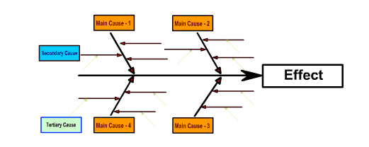
Steps in making Cause and Effect Diagram
- Determine the Effect or Problem
- Categorize the possible causes
- Describe the possible causes
7) Control Chart
Control charts are statistical tool, showing whether a process is in control or not. It is a graphical tool for monitoring the activities of an ongoing process also referred as Shewhart control charts.

Steps in making control chart
- Define Upper limit, lower limit and Center line
- Draw Chart
- Plot the data points into chart
- Interpret the control chart
More Resources /articles
Quality Control- Articles , notes , Interview Q and A
Heat Transfer Notes , Article , Interview Que. and Ans.
Mechanical Subjectwise Basic Concept Notes ,Articles
Related posts:
 What is Statistical Process Control – QC Tools
  Concurrent Engineering – Principle, Tools, Techniques, Advantages
  QA vs QC – Difference between Quality Assurance and Quality Control
  Quality Control Vs Quality Assurance – Difference Between QC and QA
  Basic QAQC Interview Questions and answers For Quality Engineers
  Quality Control Online Notes , Objective and Interview Questions
  Cost of Quality | Categories and Elements Of Quality Cost
Recent Posts
Mechanical Engineering is an essential discipline of engineering encompassing many specializations, with each contributing its unique aspect to the dynamic and inventive nature of this field. With...
The Ram Lalla idol, which is installed at Ayodhya's Ram temple has many significant religious symbols from Hinduism. All 10 incarnations of Lord Vishnu are engraved on the idol. Notably, Lord Ram is...